Cannabis Social Club Ludwigshafen
In light of Germany's cannabis legalization, the Cannabis Social Club Ludwigshafen sought to establish itself as a welcoming and inclusive community hub. Their mission? To create a space where people could connect, unwind, and enjoy cannabis without stigma or judgment.
In light of Germany's cannabis legalization, the Cannabis Social Club Ludwigshafen sought to establish itself as a welcoming and inclusive community hub. Their mission? To create a space where people could connect, unwind, and enjoy cannabis without stigma or judgment.
Challenge
Challenge
Breaking through the visual noise of overused cannabis clichés while creating a design that communicates inclusivity, friendliness, and fun was no easy task. Many cannabis logos lean on generic imagery like marijuana leaves, making it harder for brands to stand out. The challenge was to deliver a design that was fresh, culturally relevant, and distinctive.
Breaking through the visual noise of overused cannabis clichés while creating a design that communicates inclusivity, friendliness, and fun was no easy task. Many cannabis logos lean on generic imagery like marijuana leaves, making it harder for brands to stand out. The challenge was to deliver a design that was fresh, culturally relevant, and distinctive.


Approach
Approach
The "CC" eyes and marijuana head cleverly symbolize relaxation and a lighthearted, approachable atmosphere. By abstracting the marijuana motif, the design avoids clichés while remaining recognizable to the audience. The use of clean lines and a simple color palette ensures that the logo feels modern, professional, and adaptable for both digital and print applications.
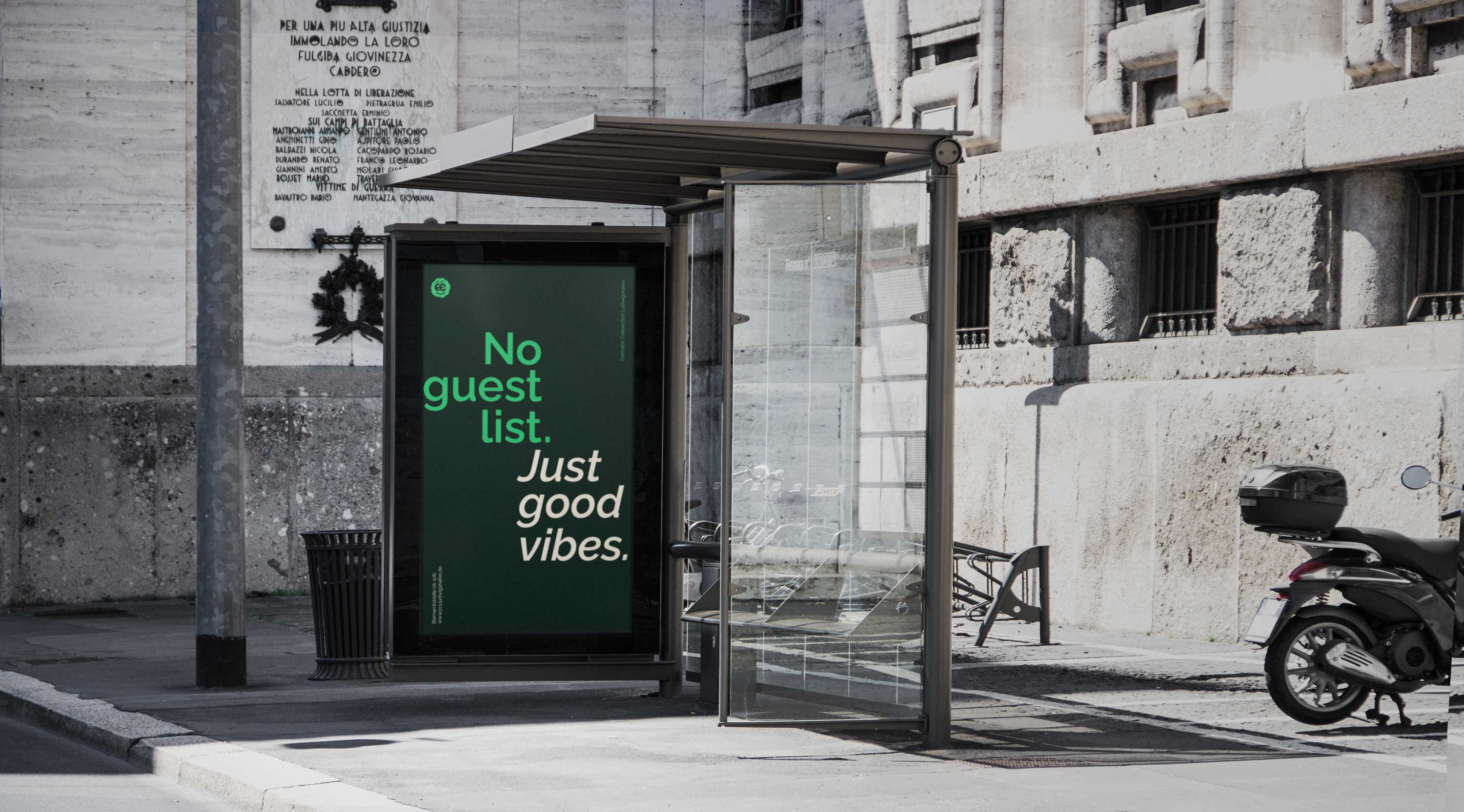
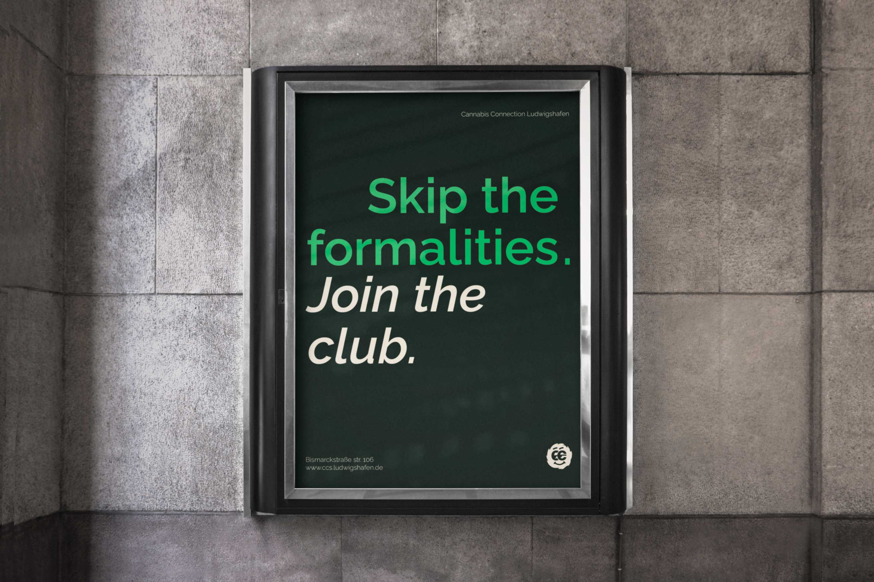
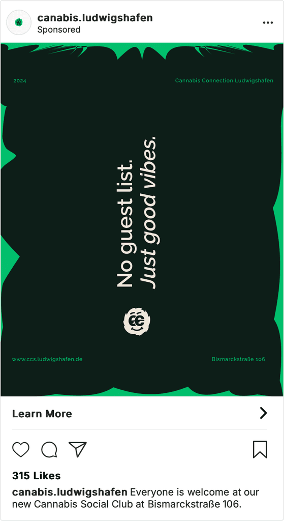
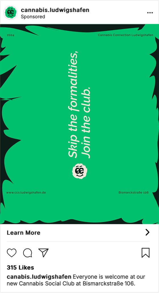
The visual identity as a whole further reinforces the club’s philosophy of openness and creativity through the use of abstract shapes and typography. Additionally, the posters complement the visuals with friendly, laid-back language, inviting new members and emphasizing the “all are welcome” spirit of the brand.
The "CC" eyes and marijuana head cleverly symbolize relaxation and a lighthearted, approachable atmosphere. By abstracting the marijuana motif, the design avoids clichés while remaining recognizable to the audience. The use of clean lines and a simple color palette ensures that the logo feels modern, professional, and adaptable for both digital and print applications.The visual identity as a whole further reinforces the club’s philosophy of openness and creativity through the use of abstract shapes and typography. Additionally, the posters complement the visuals with friendly, laid-back language, inviting new members and emphasizing the “all are welcome” spirit of the brand.






Outcome
Outcome
The resulting logo and brand identity gave the Cannabis Social Club a modern look that celebrated their core values. While escaping stereotypes, the branding successfully positioned the club as a friendly, inclusive community hub in Ludwigshafen. Initial feedback showed positive responses, with the logo and visual identity creating recognition and excitement for the newly formed club.